This post marks the end of my series on graphic design tips for TTRPG creators! Check out the rest of the series: Free Graphic Design Resources & Best Practices For TTRPG Creators, A TTRPG Creator’s Guide To Logo Design, and The Printing Process Demystified For TTRPG Creators.
To close things out, I wanted to cover the most overlooked and surprisingly nuanced aspect on this topic: layout design. I see people struggling with it all the time and it just so happens to be my area of expertise! While this article won’t instantly make you an expert layout artist, it’ll provide some great tips to help you get started.
Getting Familiar With Layout Design
Designing a layout for a TTRPG publication is unlike any other design project. You’ve got to think about the best way to display the information you are trying to convey and which pieces you are trying to emphasize. I suggest studying the work of the layout designers that came before you.
Curating A Morgue File
A morgue file, in graphic designer terms, is a place where you keep previous published design work for reference and inspiration. It is called as such because the things you put in your morgue file are “dead” or outdated. Hold on to your favorite printed pieces or screenshots of your favourite layout designs. Study what you like about them, what you think makes them effective, etc. Let these observations guide your own design decisions.
Consider Working With Templates
There’s nothing wrong with downloading a pre-designed template and using it for your layout! This is especially true for those new to layout design. Just make certain you are able to use what you download for commercial purposes. Through understanding how other designers put together a layout, you’ll eventually feel comfortable modifying what you download or even creating your own template!
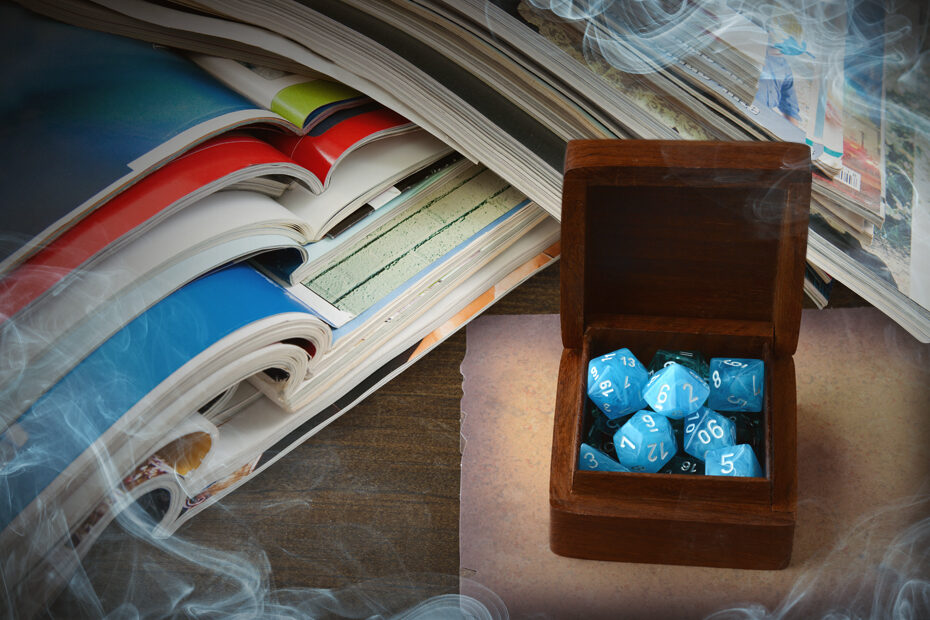
Look At Your Own TTRPG Collection
You might have a wealth of design resources hiding in plain sight! Open a TTRPG core rule book from your collection and try this exercise. Ignore the content and instead look at how that content is being presented to you. What’s the first thing that catches your eye? The second? What do you feel when you look at the elements of the design? Doing this can help you understand your own layout design approach.
Planning A Publication
Before you start designing your TTRPG project, you’ll need to have a solid plan for your publication. Multi-page documents can get difficult to manage if you start moving things around after the fact.
Publication Design Terms
Page: A single sheet of paper, front and back.
Spread: Two sheets of paper, connected either by a glued binding or by folding a large sheet in half.
Signature: Several pages printed on both sides of a large single sheet of paper. It is then folded, trimmed, bound, and cut, to become the individual pages.
Folio: Another name for page numbers, sometimes accompanied by the publication name, date, or issue number.
Flatplan: A document that shows exactly where pages or articles will be placed in a publication. It is called a flatplan because it is generally flat, as opposed to the finished book, which is bound and dimensional.
Understanding Signatures
As briefly described in the terms above, a signature is an oversized sheet of paper with several pages of a publication printed on both sides. This sheet is folded, trimmed, bound, and cut by machine. This is usually how books and magazines are printed and assembled. When you fold a standard piece of paper in half, you get four pages. Because of this, a signature is generally 4, 8, or 16 pages, depending on publication length and a printer’s machinery. As a beginner, I recommend you leave setting up “printer’s spreads” to the printers.
Creating A Flatplan
It’s helpful to have a completed flatplan before you start laying out individual pages. The flatplan is exactly what it sounds like. Decide the order of the pages you want to include prior to design. You can do this by sketching out the pages on paper, writing the page titles on post-it notes for easy swapping, etc. It’s important to note that your document’s first page is a right hand page. This is followed by multiple spreads and then finally the last page, which is a left hand page. Because your publication will most likely be printed using signatures, you’ll have to make sure your page count is divisible by 4, 8, or 16, depending on your printer’s specifications.
The Art Of Filling A Page
Designing pages that are aesthetically pleasing as well as effective at communicating your content is what you are striving to do. There is an art to designing page layouts that can take years to master. These basic principals are the cornerstones on which you can build your skills.
Hierarchy Of Design
A hierarchy of design is a system of organizing and displaying information by importance. The idea is to visually force the reader to look at what is most important first and then lead their eye around the page in the order you want. The first, most important thing you want a reader to see is known as Dominant. The second most important bit of visual information is Subdominant. And the least important information is Subordinate. These types of visual information can be separated by size, color, placement, or a multitude of other differentiators.
Embrace Negative Space
People just getting into graphic design have a tendency to want to completely fill up a page with information. However, doing that usually creates a messy page that doesn’t effectively communicate the message you are trying to convey. Negative space, or white space, is literally just space without visual information in it. This allows a viewer’s eyes to rest and lets you really emphasize the important information. How you use negative space depends on the look and feel of your publication.
Work With A Grid
Professional layout designers work with grids when putting together their pages. Grids are invisible lines that act as guides for a designer when they are laying out information. Using a grid when designing helps create order on your page. Grids can be complicated or very simple. The most simple grid is probably the two-column grid, used in many publications and books. Utilizing a grid when designing can help to create an organized layout in a familiar format that makes your project easier to read.
The Basics Of Type Setting
Type setting is the art of presenting type in the most readable, beautiful, and efficient way possible. Many first timers overlook type setting. This is detrimental to a design. A trained eye can always tell when a layout was designed without type in mind.
Typesetting Terminology
Body Copy: The text that forms the main content of your layout, usually set up in paragraphs.
Headline Type: Emphasized text that introduces sections or separates content, usually set up in sentences or one to two words.
Font Family: A group of similarly designed fonts that come in different styles, such as regular, italic, or bold.
Type Alignment: The alignment of text relative to a page or column. The most common are left, right, center, and justified.
Leading: The space between lines of type.
Orphans: A typesetting mistake. A single word, appearing at the beginning of a column or a page.
Widows: A typesetting mistake. A single word, appearing at the end of a column or a page.
Rivers: A typesetting mistake. Accidental gaps in blocks of type that appear to run through a paragraph of text.
The Rules Of Font Selection
It’s easy to get overwhelmed when selecting the fonts for a design. Ideally, you never want to use more than two font families per project. You’ll need a font for the body copy and one for headlines. For body copy, stick to tried and true fonts that are known for their readability in paragraphs. Some classic body copy fonts include Palatino, Goudy Old Style, Helvetica and Futura. For headlines, you can select fonts with more character. However, try to avoid fonts that are too dated or “of the times”. Some particularly stigmatized fonts to avoid include Comic Sans, Papyrus, and Bleeding Cowboys.
Tips For Typesetting
Typesetting, like anything else, is a skill that you get better at the more you practice it. Here are some basic tips… Font is scaled by point sizes. The standard size of body copy is 10pt. You should never set your type below 6pt. Font of this size would not be legible when reading. Make sure the lines of type aren’t too crowded or spread out by adjusting your leading. Always watch for widows, orphans, and rivers. These will disrupt the flow of a paragraph and be distracting when reading. The most common type alignments are left, justified, and centered.
Final Thoughts On Layout Design
Here are a couple more quick tips to remember when putting together your layout design:
Designing For Print Vs. Digital
Designing a layout for print is a different endeavor than if your document is intended to be digital only. For instance, there are no page constraints for a digital file. You don’t have to make your page count conform to your signature’s number. A document intended for print can easily be converted to a digital format. However, you’ll have to be mindful of this constraint when converting a digital document for print.
Incorporating Artwork
This article focused on the actual anatomy of a layout design. However, images and artwork are important elements of design that you need to think about when laying out a page. For the purposes of layout, think of artwork as another piece of visual information you are trying to convey. Where do you want it in your hierarchy of design? Is it Dominant? Subdominant? Subordinate? Will you wrap text around it or keep text away from it entirely? These are some of the questions to consider with images and artwork.
Keep Your Reader In Mind
Above all else in your layout design journey, keep your reader in mind! You should strive to design a layout that most effectively communicates your message to your reader. You can make something really visually dynamic, but it’s not necessarily successful if your audience has a difficult time absorbing the information you present to them. After designing your layout, look at it again from a reader’s perspective. Even have someone else look at it. If you feel like your work is legible and exciting yet easy to digest, then your work is done.
Can’t wait to see the all of your TTRPG layout designs! Until next time, stay creepy and happy gaming.